We often find that a local business’s most critical first impression happens on a small screen. A desktop computer is rarely the starting point when a resident needs an immediate service.
Understanding exactly why mobile-first design matters for London Ontario local businesses is essential for survival.
Our analysis aligns with the reality that over 60% of Google searches now originate from mobile devices. For localized queries, this percentage climbs even higher. Google has utilized mobile-first indexing since 2021.
We know this shift means the search engine primarily evaluates the smartphone version of your site for rankings. Ignoring this reality puts both your user experience and local visibility at a severe disadvantage.
Our team will break down the precise reasons this trend dominates local search today. Let’s look at the data and explore a few practical ways to capture these high-intent leads.
What Is Mobile-First Design?
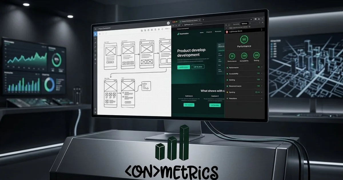
We define mobile-first design as a development strategy that builds for the smallest screen before progressing to larger displays. This method completely flips the traditional approach of creating a desktop layout and shrinking it down. Scaling down often turns mobile navigation into an afterthought.
Our developers understand that forcing desktop designs onto phones causes text to become illegible and layouts to break. Fast loading times and one-thumb navigation become the foundational elements rather than optional upgrades. Canada’s digital landscape in 2026 shows that over 95% of the population uses a mobile internet connection.
We view mobile-first as a philosophy centered entirely on this massive mobile majority. Designing for this specific context yields a significantly stronger core product. Here is how a mobile-first approach compares to traditional desktop-down design:
| Feature | Desktop-First Approach | Mobile-First Approach |
|---|---|---|
| Starting Point | Large screens with complex layouts | Small screens with essential features |
| Navigation | Hover menus and wide bars | Hamburger menus and thumb-reach zones |
| Performance | Heavy assets load by default | Lightweight assets prioritized |
| Conversion | Spread across the page | Sticky and immediately accessible |
The Local Business Mobile Opportunity
We know that local searches carry enormous purchase intent. A potential customer searching for a London coffee shop or an emergency plumber is highly motivated to act quickly. The conversion window for these queries is measured in hours rather than days.
Our localized data review indicates that a staggering 88% of mobile local searches result in a business visit within 24 hours. This immediate action makes smartphone optimization incredibly lucrative for brick-and-mortar stores. Recent 2025 statistics also show that 18% of these local searches lead directly to a purchase on the same day.
We always account for the dominance of Google Maps on smaller screens. The Local Pack takes up nearly the entire visible area on a smartphone display. A Southwestern Ontario customer sitting in their car requires a flawless digital experience to make a quick decision.
Our team wants you to capture those leads when they finally tap through to your site. Your mobile website directly dictates whether they call your office or switch to a competitor.
Mobile Design Best Practices for Local Businesses
Make Your Phone Number Tap-to-Call
We frequently see local business websites displaying their phone number as plain text. A visitor then has to memorize the digits and manually type them into their dialer app. Every extra step of friction drastically reduces the chance a prospect will actually reach out.
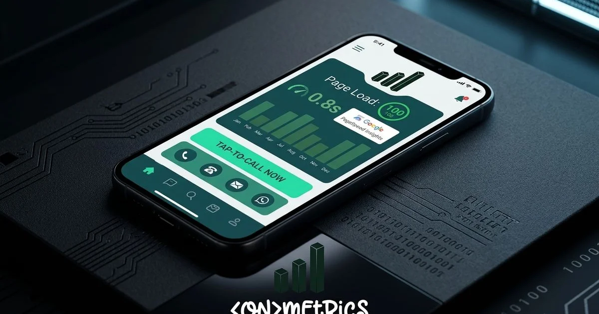
Our audits show that adding a simple tel: link allows visitors to dial with a single tap. This removes a major barrier to communication. Service businesses rely on phone calls as their primary conversion metric.
We highly recommend implementing a sticky “Call Now” button that remains visible during scrolling. Many clients experience a meaningful increase in lead volume from this single adjustment alone.
Simplify Your Navigation
We advise against porting complex desktop navigation menus directly to a mobile layout. A clean hamburger menu works best for highlighting your most critical pages. Mobile visitors typically lack the patience to dig through endless submenus.
Our designers usually limit mobile navigation to a maximum of four essential destinations. The homepage, services, contact information, and an about section satisfy almost all searchers. Consider keeping these menu best practices in mind:
- Limit total navigation items to under eight.
- Group multiple service offerings under one main category.
- Ensure tap targets are large enough to prevent accidental clicks.
- Prioritize the contact page for immediate visibility.
Prioritize Loading Speed
We cannot overstate the importance of fast loading times for mobile users. A connection in rural communities like Strathroy or Tillsonburg often lags behind London’s urban fiber networks. A site that feels snappy on a desktop might frustrate a visitor on a weak cellular signal.
Our recent analysis of 2026 performance metrics shows that if a mobile page takes more than 3 seconds to load, over 50% of users will bounce. Heavy assets drain bandwidth and kill conversion rates. You must keep the user experience smooth and responsive.
We explored performance optimization extensively in our Core Web Vitals guide, and those rules apply doubly here. Implementing proper compression prevents your site from crashing on cellular data. Our development process uses the following techniques to maximize mobile speed:
- Compress images aggressively using responsive WebP formats.
- Minimize JavaScript to save crucial kilobytes.
- Utilize a Content Delivery Network (CDN) for localized asset delivery.
- Lazy-load images located below the initial visible screen area.
Design for Thumb Navigation
We design mobile interfaces around the physical reality of how people hold their devices. Recent 2026 usability data from researcher Steven Hoober reveals that 75% of users navigate primarily with their thumbs. The bottom portion of the screen provides the most comfortable reach.
Our layouts must accommodate the 49% of people who operate their phones entirely one-handed. Tap accuracy reaches 96% in the bottom third of the screen, but plummets to 61% in the upper stretch zone. Placing a primary call-to-action in a top corner practically guarantees lower engagement.
We place critical interactive elements strictly within the natural resting zone. Follow these thumb-friendly ergonomic rules to improve usability:
- Size all buttons to a minimum of 44x44 pixels.
- Maintain generous spacing between clickable elements.
- Anchor primary conversion buttons near the bottom of the viewport.
- Keep secondary links out of the difficult upper corners.
Use Readable Typography
We set a strict minimum font size of 16 pixels for all mobile body text. Anything smaller forces a user to pinch and zoom. This immediately disrupts the layout flow and frustrates the reader.
Our typography guidelines mandate a line height of at least 1.5 times the font size for comfortable scanning. Narrow mobile viewports make standard desktop paragraphs feel like dense, unreadable walls of text. Headlines require careful scaling to avoid consuming the entire screen real estate.
We always test font proportions on physical devices rather than relying solely on browser previews. A design might look perfect on a monitor but feel overwhelming in the palm of your hand.
Streamline Forms for Mobile
We recognize that typing on a small virtual keyboard is inherently frustrating. Tiny submit buttons and fiddly dropdown selectors create massive conversion roadblocks for local businesses. Complicated forms directly cost you valuable leads.
Our research utilizing 2026 data from Tinyform shows that mobile form abandonment rates are 27% higher than desktop equivalents. Studies show a massive 68% abandonment rate for forms requiring more than five fields. A simple name, email, and brief message field usually provide enough information to initiate contact.
We actively reduce friction by keeping data collection as brief as possible. Implement these specific form optimizations to capture more inquiries:
- Utilize large input fields with clearly visible labels.
- Trigger the correct keyboard type automatically.
- Restrict required inputs to three or four essential items.
- Provide a prominent click-to-call alternative nearby.
Include Location-Specific Elements
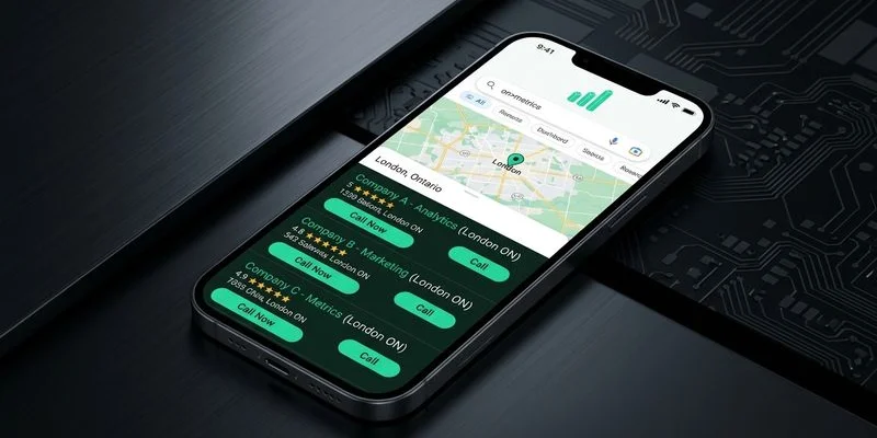
We ensure that local searchers can easily find your physical storefront. A mobile visitor is often sitting in their vehicle trying to figure out where to drive next. This simple integration bridges the gap between digital discovery and physical arrival.
Our local SEO approach involves embedding an interactive Google Map directly on the contact page. Highlighting proximity builds immediate trust with the community. Map directions remove the guesswork for new clients.
We recommend featuring these location details prominently:
- Display your full address with a direct link to Google Maps directions.
- Post accurate and up-to-date hours of operation.
- State your specific service areas clearly.
- Add parking instructions to remove any last-minute hesitation.
Test on Real Devices
We rely on actual smartphones for testing because browser simulators miss critical real-world variables. Screen glare, thumb size, and network latency dramatically alter how a person interacts with your website. Testing across different hardware prevents unexpected usability bugs.
Our 2026 market data indicates that Apple commands about 60.7% of the Canadian smartphone market, while Samsung holds roughly 22.8%. Checking your site on both major operating systems is absolutely mandatory. Find a specific service, read the description, and attempt to fill out the contact form using just one hand.
We advise navigating through your primary conversion paths on physical hardware. Every minor annoyance you encounter represents a point where a paying customer might abandon your site.
The SEO Impact: Why Mobile-First Design Matters for London Ontario Local Businesses
We closely track how Google explicitly rewards mobile-friendly websites in search results. The search engine relies on mobile-first indexing to crawl and evaluate your content. Visual parity between devices is incredibly important for consistent rankings.
Our SEO strategy consultants understand that if text or links are hidden on a smartphone, Google might ignore them entirely. Core Web Vitals are measured primarily on mobile connections, meaning poor speed directly harms your visibility. The mobile usability report inside Google Search Console serves as a vital tool for flagging layout errors.
We monitor Page Experience signals to ensure our clients maintain strong organic traffic. Catching these issues early prevents a sudden drop in lead generation.
Taking Action
We recommend running a quick diagnostic check if you are unsure about your current digital experience. A simple evaluation provides immediate clarity on where you stand. Try these two verification methods right now:
- Google’s Mobile-Friendly Test (search.google.com/test/mobile-friendly): Enter your URL to get an instant pass or fail alongside specific issues to fix.
- The pocket test: Pull out your smartphone, visit your website, and try to submit a form or find your address. Time yourself.
Our team finds that if this process takes more than 15 seconds, your interface requires immediate attention. A complete technical overhaul is rarely necessary to see a performance boost. Targeted improvements to speed and navigation can dramatically elevate your mobile conversion rate.
We are fully prepared to help you capture more local traffic.
Understanding why mobile-first design matters for London Ontario local businesses gives you a competitive edge.
Ready to improve your mobile experience? Contact us for a free mobile website audit, or explore our web design services to learn how we build mobile-first websites that convert local search traffic into customers.